The early days were wild.
The original release of the Atari ST came with a tiny, minimal ROM that loaded the rest of the OS from a floppy disk. After this initial batch, they shipped the computer with the full OS on ROM. Between these two releases, there are some changes to the font used to render text on the screen. Some subtle, some not so subtle. When I recently published some updated conversions of the fonts, I decided to include the “Disk TOS” version of the fonts as well, which led me to doing some full comparisons of the glyphs between the two versions of the fonts.
Overall Comparison
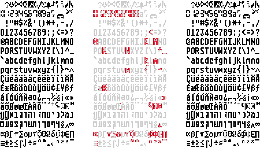
To start with, consider the 8×16 font used in high-resolution mode. In each case, the font on the left is the original disk-based version, the font on the right is the updated ROM-based version, and the changes are marked up inset in red.
The Shift
Many of the changes involve the alignment of the character within the character cell. Most characters have a width of 6 pixels in the middle of the 8-pixel width, but some of the characters need a width of 7 pixels, and these were originally drawn aligned to the right-hand side. Since GEM renders bold text by overprinting to the right, any character that’s already on the right-hand side of the cell loses its emboldening as it overshoots the edge of the cell. The ROM version of the font fixes this issue by shifting these characters to the left.
The Ligatures
A couple of changes involve the ligatures “æ” and “Œ”. For “æ”, the outside vertical strokes were thickened up, presumably to improve consistency with similar characters. For “Œ”, the right-hand side is shortened to match the look of the “Æ” character.
The Pilcrow
The biggest change is in the pilcrow character “¶”. The “fixed” version has a pretty conventional look, but the original version has a different interpretation that doesn’t seem to appear anywhere else. It seems as though this was “fixed” to look more conventional along with the other tidying up.
Trademarks
Taking a look at the changes to the 8×8 font, the largest change is with the trademark symbol “™”. In the original disk version, it’s a weird diagonal layout that seems similar to the form-feed, carriage return, and escape characters.
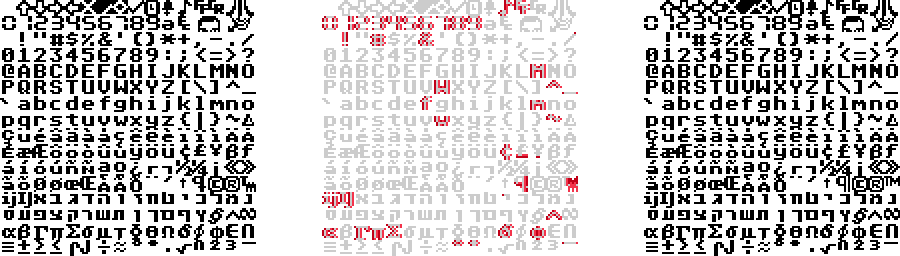
After the official ROM TOS release, the 8×8 trademark character has a more conventional look which suggests a general move to keep things consistent.
Tiny Tweaks
In the 8×8 font, the exclamation mark was originally aligned slightly left of centre. So along with some left-shifting to free up the right-hand side of the cell, this character shifts right to align with the centre. There’s an extra pixel on the slash character, for consistency with the backslash. The weirdly squished up currency symbols “£” and “¥” get extended to the regular cell height. And the Hebrew character “י” (yod) gets an extra pixel to help its readability.
Tiny Letters
In the 6×6 font, most of the changes are the left-shift to free up the right-hand border. Among the remaining changes:
- additional pixels on top of the checkmark character “✓”.
- a complete reversal of the design on the backslash character instead of a plain left shift.
- thinning out of the accents on several of the accented letters, including stand-alone “¨” and “´”.
Theories
Based on the chaotic timeline of the original release of the Atari ST, it’s no surprise that some rough edges needed tweaking. The original Atari ST graphics were mostly pulled together by Jerome Domurat. In an interview he talks about his initial involvement:
“at that point there wasn’t […] any kind of TrueType, it was all bitmap type so I did the initial font sets and […] everything from the cursors and pointers to […] the […] icons and working on the behavior of […] how those things would interact.”
“I was developing things on […] the 800 or on paper.”
“ThunderScan […] which was an early scanner […], it requires a 128K Mac and an ImageWriter printer, […] I actually used that to convert a number of drawings and things to screen.”
Given the manual approach of this early development, it’s easy to imagine this process as not leaving much room for immediate feedback. With software only coming together relatively late on, it’s easy to see how the bold text issue would be missed. Similarly, using the characters in a variety of different contexts would quickly reveal areas of inconsistency.
Behind the Pilcrow
I wanted to get some insight into why the original look of the pilcrow character was so different to the conventional design. If you look up images of the character set from early documentation, the glyphs are from the disk-based version of the font.
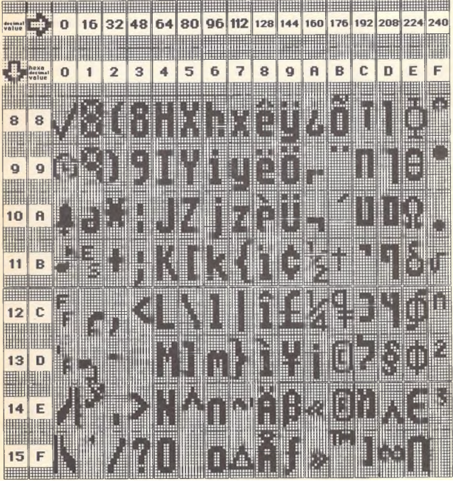
After a little hunting around in older GEM documentation I finally found the character set described in the GEM VDI Reference Guide. The whole table depicts characters in a wild range of styles; the alternative pilcrow is extremely prominent here.
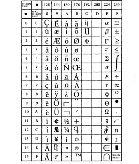
I haven’t yet found anything definitive that’s earlier than this reference. Screen drivers from the GEM 1.1 release seem to only use the first 128 characters in their embedded fonts, and when they include a pilcrow character it’s at position 0x14, matching the DOS code page 437 arrangement, and with the conventional appearance. Later fonts that use all 256 entries seem to include a second pilcrow character - the one at 0x14 remains and is an open design, while the one at 0xBC has a filled design, but neither has the horizontal line design.
My best guess here is that somewhere within DRI, the character set was pulled together from a variety of sources and depicted as well as possible with the technology available, and then once it got to Atari it was poked in pretty faithfully from there. Tidying up to get the full ROM ready for release gave them the opportunity to tweak the design to the font we know today.
Credits
Reference material obtained from these good folks: